styled-components로 재사용성 높은 버튼 만들기
components 디렉터리 아래에 Button이라는 컴포넌트를 생성해 준다.
import React from "react";
import styled from "styled-components";
const StyledButton = styled.button`
  /* 공통 스타일*/
  display: inline-flex;
  outline: none;
  border: none;
  border-radius: 4px;
  color: white;
  font-weight: bold;
  cursor: pointer;
  padding-left: 1rem;
  padding-right: 1rem;
  /* 크기 */
  height: 2.25rem;
  font-size: 1rem;
  /* 색상 */
  background: #228be6;
  &:hover {
    background: #339af0;
  }
  &:active {
    background: #1c7ed6;
  }
  /* 기타 */
  & + & {
    margin-left: 1rem;
  }
`;
우선 styled-components를 import 시켜주고
styled.button을 지정해준다. ` 백틱을 이용해서 스타일을 지정해준다.
&:hover 는 마우스를 해당 엘리먼트위에 위치시켰을 때를 의미하고 active는 클릭했을 때를 의미한다.
& + &은 이전에 학습했던 것 처럼 두개의 엘리먼트가 나란히 위치했을 때를 의미한다.
import React from "react";
import styled from "styled-components";
const StyledButton = styled.button`
  /* 공통 스타일*/
  display: inline-flex;
  outline: none;
  border: none;
  border-radius: 4px;
  color: white;
  font-weight: bold;
  cursor: pointer;
  padding-left: 1rem;
  padding-right: 1rem;
  /* 크기 */
  height: 2.25rem;
  font-size: 1rem;
  /* 색상 */
  background: #228be6;
  &:hover {
    background: #339af0;
  }
  &:active {
    background: #1c7ed6;
  }
  /* 기타 */
  & + & {
    margin-left: 1rem;
  }
`;
function Button({children, ...rest}) {
  return <StyledButton {...rest}>{children}</StyledButton>;
}

export default Button;
Button 컴포넌트에서
그리고 App.js에서 해당 컴포넌트를 사용한다.
이전에 만들었던 Circle을 제거해주고 return의 내용도 모두 지워준다. 그리고 AppBlock이라는 styled-components를 하나 만들어준다.
내부에는 width,margin,margin-top, border, padding을 설정해준다.
import React from "react";
import styled from "styled-components";
import Button from "./components/Button";

const AppBlock = styled.div`
  width: 512px;
  margin: 0 auto;
  margin-top: 4rem;
  border: 1px solid black;
  padding: 1rem;
`;
function App() {
  return (
    <AppBlock>
      <Button>Button</Button>
    </AppBlock>
  );
}

export default App;
App에서는 AppBlock와
그리고 styled 를 import할 때 불러온 {css}도 지워준다.
여기까지 렌더링된 결과를 보면 버튼이 잘 생성된 것을 볼 수 있다.
Polished 스타일 유틸 함수
이 라이브러리는 여러 함수들이 들어있어서 색상의 변화를 주거나 영역설정 혹은 ellipsis등등의 다양한 기능들이 존재한다.
사용을위해 polished를 설치한다.
$ yarn add polished
그리고 Button 컴포넌트의 import 쪽에서
import { darken, lighten } from 'polished'darken과 lighten함수를 불러와 준다.
/* 색상 */
  background: #228be6;
  &:hover {
    background: ${lighten(0.1, "#228be6")};
  }
  &:active {
    background: ${darken(0.1, "#228be6")};
  }
구현은 lighten과 darken 함수를 불러와서 인자로 0.1 몇퍼센트 밝거나 어둡게할 것인지와 색상값을 넣어준다. 이제 추가로 회색과 핑크색 버튼을 만들 것인데, Button.js 에서 선언해서 사용하지 않고 App.js에서 선언하고 그 색상을 어떤 styled 컴포넌트이든지 쉽게 조회해서 사용할 수 있게 할 것이다.
styled에서 ThemeProvider 를 불러와주고 을 감싸준다.
그다음에 theme이라는 객체를 설정해준다,
객체를 넣을 때는 바로 넣어줘도되고 위에서 선언해서 넣어줘도된다.
const palette = {
  blue: "#228be6",
  gray: "#496057",
  pink: "#f06595",
};
function App() {
  return (
    <ThemeProvider theme={{palette}}>
      <AppBlock>
        <Button>Button</Button>
      </AppBlock>
    </ThemeProvider>
  );
}
이제 Button.js 에서 theme 안의 색상들을 읽어올 것이다.
만약 blue 색상을 읽어오고 싶다고하면
background: ${(props) => props.theme.palette.blue};
  &:hover {
    background: ${(props) => lighten(0.1, props.theme.palette.blue)};
  }
  &:active {
    background: ${(props) => darken(0.1, props.theme.palette.blue)};
  }
이런식으로 불러올 수 있다.
위에서 사용한 함수를 여러번 사용하는 대신에 하나의 함수안에 묶어서 넣을 수 있다. styled에서 {css}를 불러와주고,
${props=> {
    const color = props.theme.palette.blue;
    return css`
    background: ${color},
    &:haover{
        background: ${lighten(0.1, color)};
    }
    &:action{
        background: ${darken(0.1, color)};
    }
    `;
}}
해당 코드를 상단에 추가해 주고 기존에 선언했던 코드를 삭제해준다. blue 말고 다른 색상도 설정해주기위해 Button 컴포넌트의 props로 color를 추가해주고 defaultProps는 color 값을 blue로 설정해준다.
사실 ..rest 에 color 도 들어가기 때문에 따로 빼주지 않아도 되지만 명시하고 있는것이 코드이해에 좋기 때문에 따로 설정해 줬다.
import React from "react";
import styled, { css } from "styled-components";
import { darken, lighten } from "polished";

const StyledButton = styled.button`
  /* 공통 스타일*/
  display: inline-flex;
  outline: none;
  border: none;
  border-radius: 4px;
  color: white;
  font-weight: bold;
  cursor: pointer;
  padding-left: 1rem;
  padding-right: 1rem;
  /* 크기 */
  height: 2.25rem;
  font-size: 1rem;
  /* 색상 */
  ${(props) => {
    const color = props.theme.palette[props.color];
    return css`
      background: ${color};
      &:hover {
        background: ${lighten(0.1, color)};
      }
      ,
      &:active {
        background: ${darken(0.1, color)};
      }
    `;
  }}

  /* 기타 */
  & + & {
    margin-left: 1rem;
  }
`;

function Button({ children, color, ...rest }) {
  return (
    <StyledButton color={color} {...rest}>
      {children}
    </StyledButton>
  );
}

Button.defaultProps = {
  color: "blue",
};
export default Button;
그리고 blue 대신에 [props.color]를 넣어준다.
여기 까진 잘 작동하고
이제 App.js에서 gray와 pink 를 넘겨준 버튼들을 생성해준다.
function App() {
  return (
    <ThemeProvider theme={{ palette }}>
      <AppBlock>
        <Button>Button</Button>
        <Button color="gray">Button</Button>
        <Button color="pink">Button</Button>
      </AppBlock>
    </ThemeProvider>
  );
}
이제 버튼이 완성되었다. 여기서 부터는 지금 까지 작업을 리팩토링 하는 과정이다.
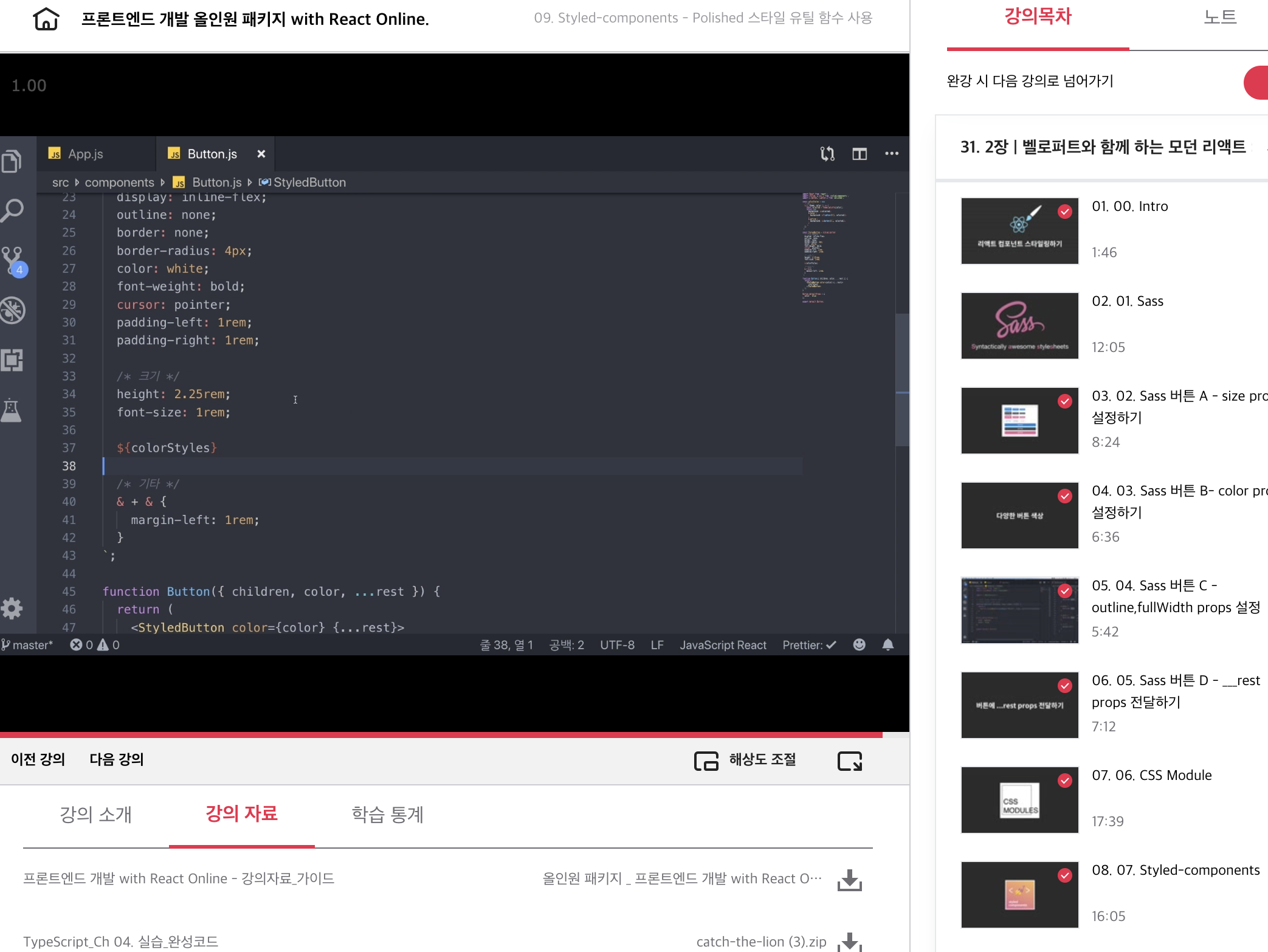
color 라는 이름 대신 selected 를 사용하고 props를 가져올 때 theme,과 color를 비구조할당 해주고 props라고 명시하는 부분을 지워줄 수 있다. 그리고 이 코드를 styled.button 밖으로 빼낼 수도 있다.
import React from "react";
import styled, { css } from "styled-components";
import { darken, lighten } from "polished";
const colorStyles = css`
  ${({ theme, color }) => {
    const selected = theme.palette[color];
    return css`
      background: ${selected};
      &:hover {
        background: ${lighten(0.1, selected)};
      }
      ,
      &:active {
        background: ${darken(0.1, selected)};
      }
    `;
  }}
`;
const StyledButton = styled.button`
  /* 공통 스타일*/
  display: inline-flex;
  outline: none;
  border: none;
  border-radius: 4px;
  color: white;
  font-weight: bold;
  cursor: pointer;
  padding-left: 1rem;
  padding-right: 1rem;
  /* 크기 */
  height: 2.25rem;
  font-size: 1rem;
  /* 색상 */
  ${colorStyles};
  /* 기타 */
  & + & {
    margin-left: 1rem;
  }
`;

function Button({ children, color, ...rest }) {
  return (
    <StyledButton color={color} {...rest}>
      {children}
    </StyledButton>
  );
}

Button.defaultProps = {
  color: "blue",
};
export default Button;
해당 내용은 아래 링크에서 수강할 수 있다.
프론트엔드 개발 올인원 패키지 with React Online. 👉https://bit.ly/2ETLEzm
프론트엔드 개발 올인원 패키지 with React Online. | 패스트캠퍼스
성인 교육 서비스 기업, 패스트캠퍼스는 개인과 조직의 실질적인 '업(業)'의 성장을 돕고자 모든 종류의 교육 콘텐츠 서비스를 제공하는 대한민국 No. 1 교육 서비스 회사입니다.
www.fastcampus.co.kr
'fastcampus' 카테고리의 다른 글
| [패스트캠퍼스 수강 후기] 프론트엔드 인강 100% 환급 챌린지 38회차 미션 (0) | 2020.10.14 |
|---|---|
| [패스트캠퍼스 수강 후기] 프론트엔드 인강 100% 환급 챌린지 37회차 미션 (0) | 2020.10.13 |
| [패스트캠퍼스 수강 후기] 프론트엔드 인강 100% 환급 챌린지 35회차 미션 (0) | 2020.10.11 |
| [패스트캠퍼스 수강 후기] 프론트엔드 인강 100% 환급 챌린지 34회차 미션 (0) | 2020.10.10 |
| [패스트캠퍼스 수강 후기] 프론트엔드 인강 100% 환급 챌린지 33회차 미션 (0) | 2020.10.09 |


댓글