버튼에 다양한 사이즈를 적용해본다. 우선 Button 컴포넌트에서 size라는 props를 받아오게 한다. 그리고 size 그대로 StyledButton에 전달한다.
그리고 defaultProps는 medium으로 설정한다.
function Button({ children, color,size, ...rest }) {
  return (
    <StyledButton size={size} color={color} {...rest}>
      {children}
    </StyledButton>
  );
}

Button.defaultProps = {
  color: "blue",
  size: "medium"
};
크기부분 styled을 props.size에 따라 다른 값을 주면된다.
기존에 정의한
height: 2.25rem;
font-size: 1rem;
를 지우고
${(props) =>
    props.size === "large" &&
    css`
      height: 3rem;
      font-size: 1.25rem;
    `}
  ${(props) =>
    props.size === "medium" &&
    css`
      height: 2.25rem;
      font-size: 1rem;
    `}
${(props) =>
    props.size === "small" &&
    css`
      height: 1.75rem;
      font-size: 0.875rem;
    `}
이렇게 large, medium, small 순서로 각각 크기에 따른 속성을 정의해준다.
그리고 colorStyles를 분리한것처럼 sizeStyles를 정의해준다.
const sizeStyles = css`
  ${(props) =>
    props.size === "large" &&
    css`
      height: 3rem;
      font-size: 1.25rem;
    `}
  ${(props) =>
    props.size === "medium" &&
    css`
      height: 2.25rem;
      font-size: 1rem;
    `}
  ${(props) =>
    props.size === "small" &&
    css`
      height: 1.75rem;
      font-size: 0.875rem;
    `}
`;
그리고
${colorStyles};
${sizeStyles};
${colorStyles}; 밑에 sizeStyles를 불러와준다.
App.js에서 다양한 사이즈의 버튼들을 준다.
const ButtonGroup = styled.div`
  & + & {
    margin-top: 1rem;
  }
`;
우선 ButtonGroup을 하나 선언해주고
같이 위치하게 되면 margin-top을 설정하게 해준다.
그리고 ButtonGroup 을 사용해서 Button들을 감싸준다.
function App() {
return (
<ThemeProvider theme={{ palette }}>
<AppBlock>
<ButtonGroup>
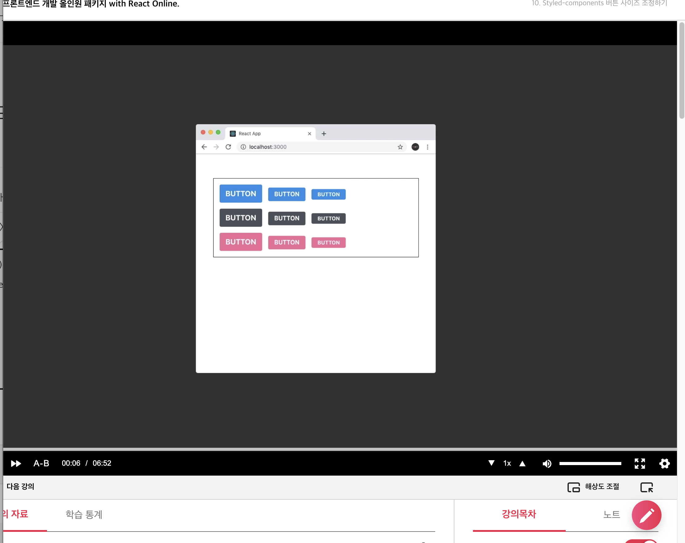
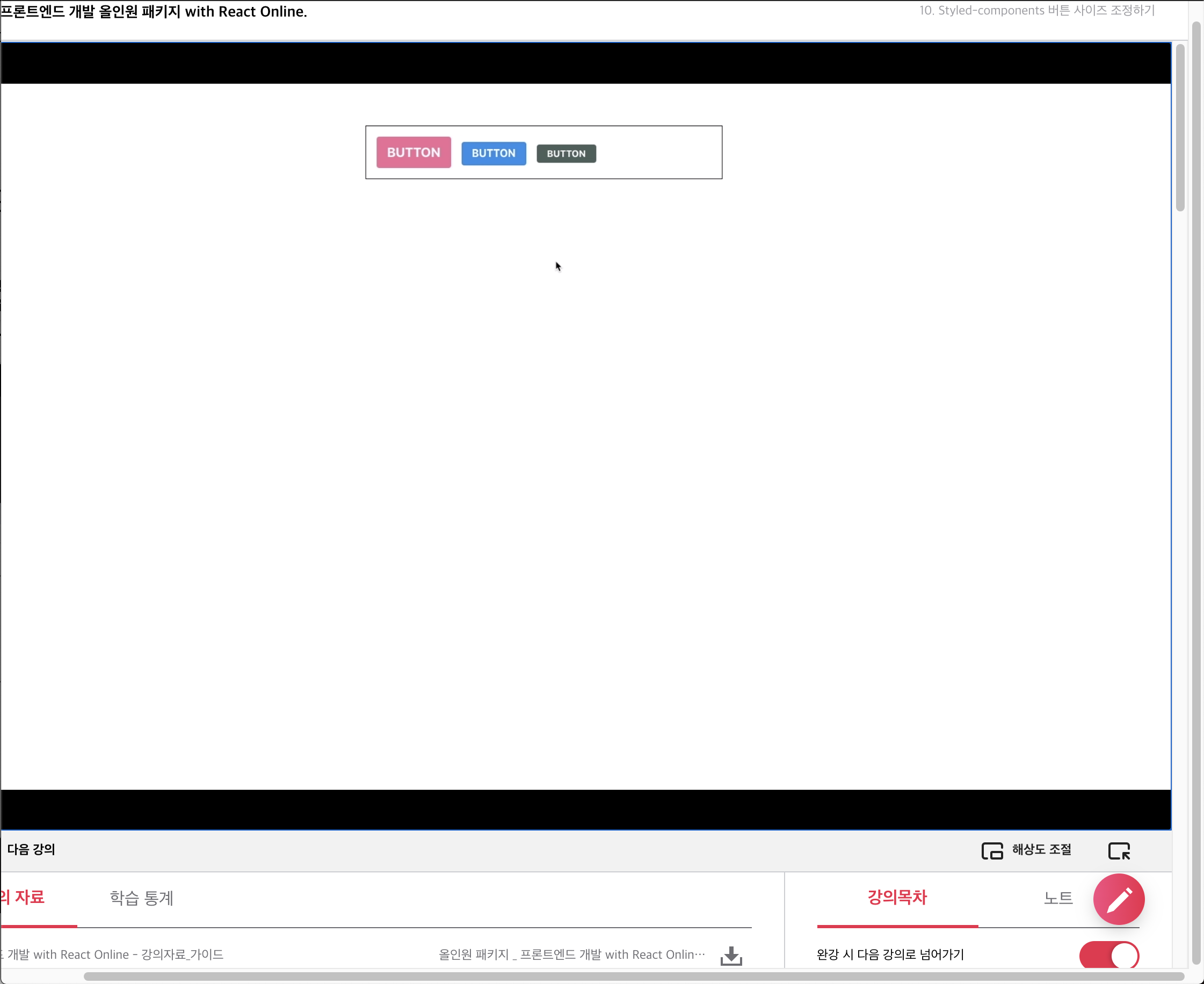
<Button size="large">Button</Button>
<Button>Button</Button>
<Button size="small">Button</Button>
</ButtonGroup>
</AppBlock>
</ThemeProvider>
);
}그리고 각각 size를 전달해준다.
function App() {
  return (
    <ThemeProvider theme={{ palette }}>
      <AppBlock>
        <ButtonGroup>
          <Button size="large">Button</Button>
          <Button color="pink">Button</Button>
          <Button size="small" color="gray">
            Button
          </Button>
        </ButtonGroup>
      </AppBlock>
    </ThemeProvider>
  );
색상도 잘 적용되는지 살펴본다.
그런데 우리가 기존에 구현한 sizeStyles를 보면 중복되는 코드가 많다. 이를 리팩토링해본다.
우선 height와 font-size가 들어있는 객체를 생성해준다.
const sizes = {
  large: {
    height: "3rem",
    fontSize: "1.25rem",
  },
  medium: {
    height: "2rem",
    fontSize: "1rem",
  },
  small: {
    height: "1.75rem",
    fonsSize: "0.875",
  },
};
const sizeStyles = css`
${({ size }) => css`
height: ${sizes[size].height};
font-size: ${sizes[size].fontSize};
`}
`;그리고 기존 작성했던 sizeStyles의 내용을 지우고 size를 비구조할당을 통해 불러오고 height과 font-size를 지정해 준다.
이렇게 밖으로 꺼내주는 작업이 필수적인 요소는 아니지만 때때로 코드를 유지보수할 때 도움이 될 수 있다.
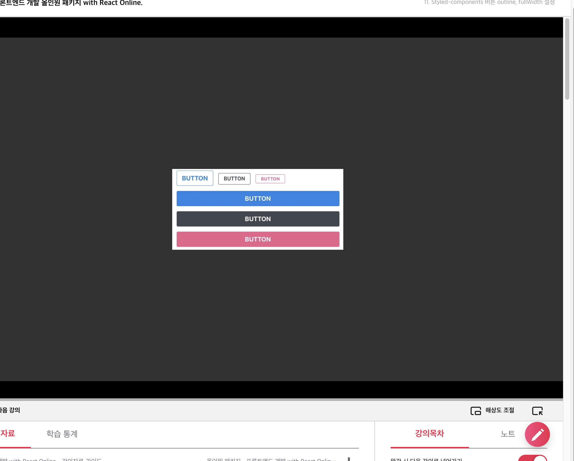
Button에 outline 과 fullwidth 설정
outline을 설정하면 버튼에서 테두리만 보이게되고 fullwidth를 설정하면 버튼이 차지할 수 있는 최대의 넓이를 차지하게 된다.
우선 Button 컴포넌트에 outline을 props로 받아오고 StyledButton에게 그대로 전달해 준다.
outline은 defaultProps를 따로 지정하지 않는다 Boolean 값을 가지고 있어서 값이 제대로 전달되지 않아 undefined가 전달되게 되면, 자동으로 false로 간주하게 된다.
const colorStyles = css`
  ${({ theme, color }) => {
    const selected = theme.palette[color];
    return css`
      background: ${selected};
      &:hover {
        background: ${lighten(0.1, selected)};
      }
      &:active {
        background: ${darken(0.1, selected)};
      }
      ${(props) =>
        props.outline &&
        css`
          color: ${selected};
          border: 1px solid ${selected};
          background: none;
          &:hover {
            background: ${selected};
            color: white;
          }
        `}
    `;
  }}
`;
그리고 props로 outline을 받아와서 true인 경우 위의 코드와 같이 속성을 지정해 준다.
<ButtonGroup>
          <Button size="large" outline>
            Button
          </Button>
          <Button color="pink" outline>
            Button
          </Button>
          <Button size="small" color="gray" outline>
            Button
          </Button>
        </ButtonGroup>
그리고 App.js 에서
ButtonGroup 하나를 더 생성해서 outline 을 속성으로 추가해 준다.
function Button({ children, color, size, outline, fullwidth, ...rest }) {
  return (
    <StyledButton
      size={size}
      color={color}
      outline={outline}
      fullwidth={fullwidth}
      {...rest}
    >
      {children}
.
.
fullwidth의 구현도 마찬가지로 props를 받아오고 넘겨준다.
이번에는 처음부터 밖에 구현해준다.
const fullWidthStyles = css`
    ${props => props.fullwidth && css`
    width:100%;
    justify-content: center;
    & + &{
        margin-left:0;
        margin-top: 1rem;

    }
    `}
`;
이제 fullWidthStyles을 넣어준다.
/* 색상 */
  ${colorStyles};
  ${sizeStyles};
/* 기타 */
  & + & {
    margin-left: 1rem;
  }
colorStyles와 sizeStyles를 밑에있는 기타 코드를 덮어 씌워야 하기 때문에 해당 코드를 위로 올려주고 sizeStyles아래에 fullWidthStyles를 추가해 준다.
 /* 색상 */
  ${colorStyles};
  ${sizeStyles};
  ${fullWidthStyles};
`;
그리고 App.js에서 fullWidthStyle도 추가해준다.
<ButtonGroup>
          <Button size="large" fullwidth>
            Button
          </Button>
          <Button color="pink" size="large" fullwidth>
            Button
          </Button>
          <Button color="gray" size="large" fullwidth>
            Button
          </Button>
        </ButtonGroup>
해당 내용은 아래 링크에서 수강할 수 있다.
프론트엔드 개발 올인원 패키지 with React Online. 👉https://bit.ly/2ETLEzm
프론트엔드 개발 올인원 패키지 with React Online. | 패스트캠퍼스
성인 교육 서비스 기업, 패스트캠퍼스는 개인과 조직의 실질적인 '업(業)'의 성장을 돕고자 모든 종류의 교육 콘텐츠 서비스를 제공하는 대한민국 No. 1 교육 서비스 회사입니다.
www.fastcampus.co.kr
'fastcampus' 카테고리의 다른 글
| [패스트캠퍼스 수강 후기] 프론트엔드 인강 100% 환급 챌린지 39회차 미션 (0) | 2020.10.15 |
|---|---|
| [패스트캠퍼스 수강 후기] 프론트엔드 인강 100% 환급 챌린지 38회차 미션 (0) | 2020.10.14 |
| [패스트캠퍼스 수강 후기] 프론트엔드 인강 100% 환급 챌린지 36회차 미션 (0) | 2020.10.12 |
| [패스트캠퍼스 수강 후기] 프론트엔드 인강 100% 환급 챌린지 35회차 미션 (0) | 2020.10.11 |
| [패스트캠퍼스 수강 후기] 프론트엔드 인강 100% 환급 챌린지 34회차 미션 (0) | 2020.10.10 |


댓글